INSPIRATIONS

New Colours for 2020
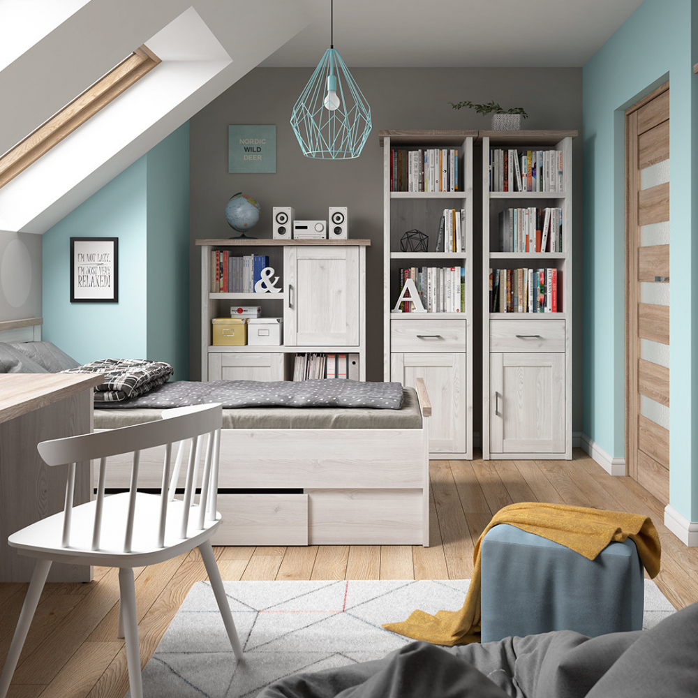
Many major paint and accessories manufacturers have already announced their flagship colours for the next year. Can we read something especially interesting into those colours? Or maybe they just offer an opportunity to do something new, whether buying a small item, or painting a whole room.
Colour is one of the most important elements creating the mood of any interior. Appropriate use of colour brings desirable aesthetic and psychological effects.
What colors will be fashionable in 2020?
Dulux has chosen Tranquil Dawn for its colour of the year 2020. It is a hazy pale green, really creating the impression of a dawn on a lake or in a cottage on the edge of the forest on a spring morning. Dulux claim that the choice of this hue was dictated by the desire to return to human nature and nature in general from a world full of technology, robots, artificial intelligence and alienation of people from each other. It is a colour of relaxation and serenity, and in combination with neutral pastels or expressive jewel hues, it is perfect for creating an interior conducive to building interpersonal relationships.
The company producing wallpapers and other high-end furnishings, Graham & Brown also have chosen a shade of green, but how different it is! Aldeline (this name reminds us of the less-known first name of Virginia Woolf, also referring to the complementary floral wallpaper named Bloomsbury) is a deep, almost emerald bottle green. Also inspired by the natural colours of leaves and other vegetation, it helps us balance the effects of ubiquitous technology. Green interiors are conducive to the creation of natural, peaceful vibrations, and deep and vibrant shades work great on ''statement items'' in various interior designs, especially in more complex and luxurious styles.
In turn, the paint company Benjamin Moore offers us for 2020 a shade of pink, named in a similar vein to the one chosen by Dulux -First Light, a warm rose that actually evokes the delicate rays of a dawn. This subtle, airy pink, slightly dusky and pleasantly warm, perfectly fits into pastel schemes, and a surprisingly large number of combinations, always bringing a note of joy and rejuvenation. Warm colors are gradually replacing cool neutral shades, and this one is especially flattering to human facial complexion.
Another paint company, the American Behr, has also chosen a shade of green for 2020, this time it's a pastel, slightly yellowish hue, straight from a green meadow, under the nameBack to Nature. Again, we see a producer whose choice is inspired by trends of self-care, well-being and simply the return to true, living nature.
General trends
All these natural and ecological themes are more and more visible in current interior design trends and will probably appear in collections for a good few seasons. Other names appearing in trend spotter notes and blogs are, for example, 'New Mint' (another pastel green) or 'Chinese Porcelain' (which is actually a vivid blue). On the other hand, virtually everyone agrees that shades of grey are definitely on the way out.
We don't have the color of the year 2020 from the giant of the colour design, Pantone, yet. There has been talk of vivid shades of fiery orange and golden saffron yellows, but maybe Pantone will also be seduced by the undoubted charms of greenery?
